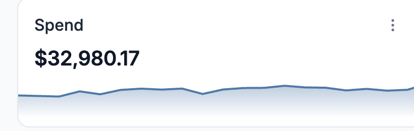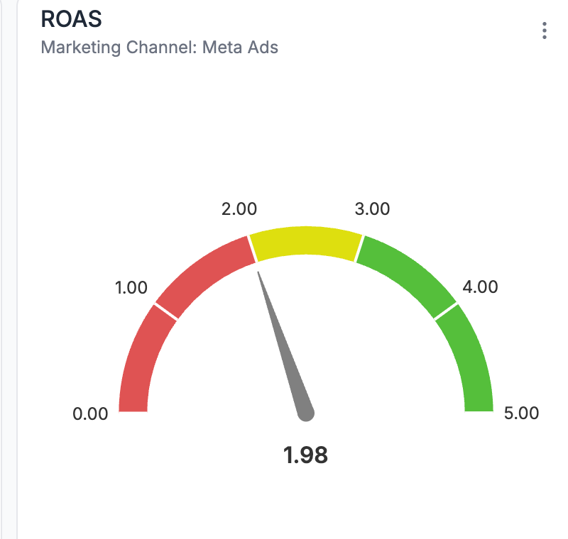

We recently launched Custom Reports in ThoughtMetric, giving teams more control over how performance data is visualized and shared. One of the useful widgets in this release is the Gauge Widget.
The gauge is designed to answer a simple question quickly: Are we on track?

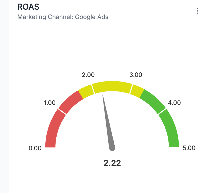
It works especially well for performance metrics like ROAS and MER.
What the Gauge Widget Is Best For
The Gauge Widget acts as a progress indicator. Instead of just showing a raw metric, it places that metric within defined ranges so you can instantly see whether performance is under target, acceptable, or strong.
How to Build a Gauge Widget
1. Go to “Add Widget” and select the Gauge Widget
2. Select your metric
Choose ROAS as the metric you want to track.
3. Apply a channel filter (optional)
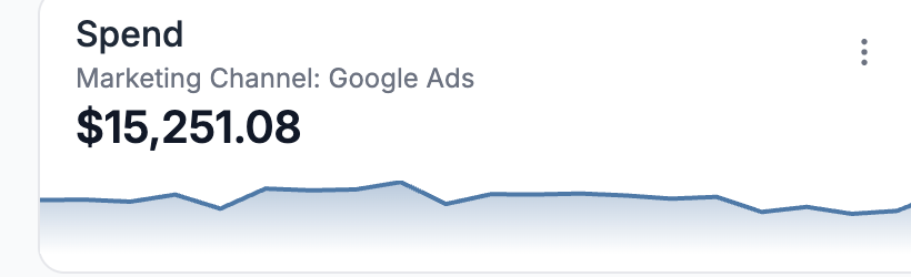
If you want to isolate performance, select a specific channel such as Google Ads. You can also leave this unfiltered to view overall performance.
4. Define performance thresholds
Choose ROAS as the metric you want to track.
3. Apply a channel filter (optional)
If you want to isolate performance, select a specific channel such as Google Ads. You can also leave this unfiltered to view overall performance.
4. Define performance thresholds
- Set the lower threshold where performance starts to become acceptable (for example, yellow starting at 2.0 ROAS).
- Define the higher threshold where performance is strong (for example, green starting at 3.0 ROAS).
5. Create and resize the widget
Once created, the widget can be resized and positioned anywhere in your report layout.
6. Save your layout
Your gauge will now update automatically as performance changes.
Once created, the widget can be resized and positioned anywhere in your report layout.
6. Save your layout
Your gauge will now update automatically as performance changes.
Why Teams Use the Gauge Widget
The Gauge Widget is ideal for dashboards that need to be understood at a glance. It frames performance relative to clear goals.
For teams reporting to leadership or clients, this kind of visual clarity makes marketing performance reviews faster.
One of Many Custom Report Options
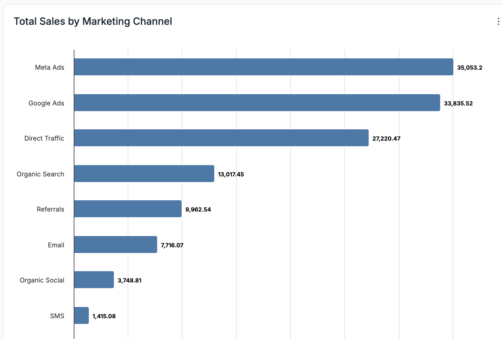
The Gauge Widget is just one example of what’s possible with Custom Reports in ThoughtMetric. You can combine it with tables, bar charts, funnels, and other widgets to build dashboards tailored to your team’s needs.
To learn more, book a ThoughtMetric demo.