"We looked at a number of competitors in the space, but ultimately chose ThoughtMetric because of its easy-to-understand interface and the support offered during and after implementation."
"With ThoughtMetric, we were able to refine our analytics and provide verifiable proof of the revenue we were driving in a previously underperforming area of the business."
The 11 Different Widgets You Can Customize in ThoughtMetric
Alex Fusco
January 16, 2026
Last Updated:
Reports are most helpful if the information is immediately understandable, not understandable after a ten-minute explanation. That’s the philosophy behind Custom Reports in ThoughtMetric.
Each widget exists for a specific reason. Some are built to highlight a single metric. Others are designed to show relationships, movement over time, and more. Used well, they turn a dashboard from a pile of numbers into a story about how your business is performing.
Below is a walk-through of the 11 widgets you can customize in ThoughtMetric.
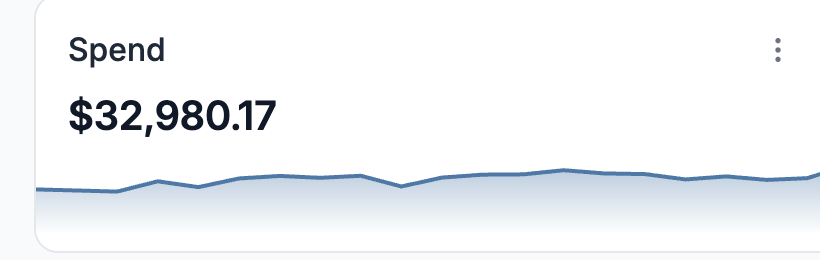
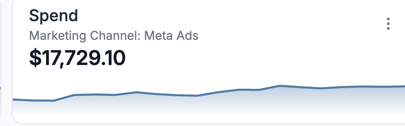
1. Number Widget
Single value metric
This widget is ideal when the number itself is the message. Total revenue, total orders, total sessions, total ad spend.
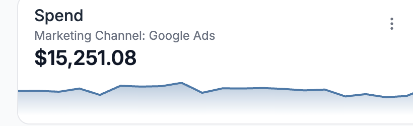
2. Key Indicator Widget
Single metric with trend context
The Key Indicator widget takes a single metric and adds context over time. Instead of just showing today’s revenue or conversion rate, it shows how that number is moving.
3. Table Widget
Rows and columns
The Table widget is best when you need to show multiple metrics across multiple dimensions. Revenue by channel. Conversion rate by campaign. Sessions, orders, and AOV by product.
4. Line Widget
Trends over time
The Line widget shows how a metric changes over time. Revenue growth, session trends, conversion rate changes, or channel performance over weeks and months all fit naturally here. Use this widget when the story you’re telling involves momentum, seasonality, or cause and effect across time.
5. Stacked Area Widget
Filled trend area
The Stacked Area widget is a variation on trend analysis, but with an added layer: composition. Instead of just showing total growth, it shows how different components contribute to that total over time. Think revenue by channel stacking together as the business grows, or traffic sources shifting in importance month to month.
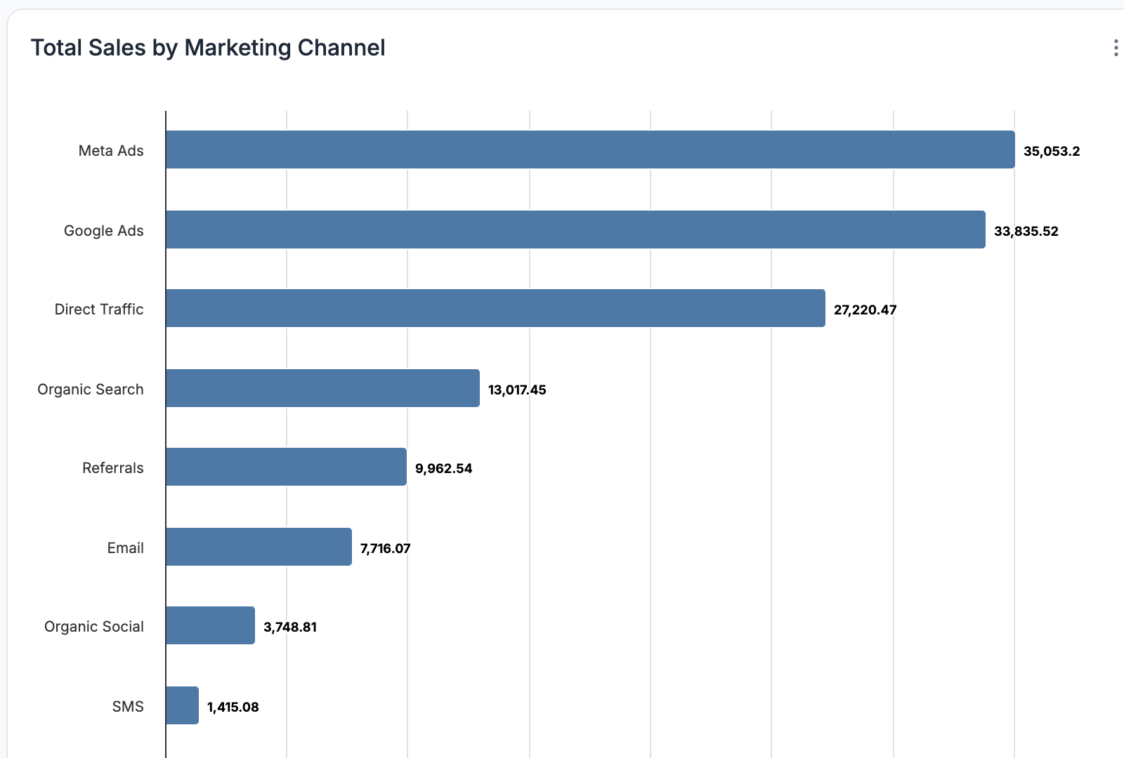
6. Bar Widget
Compare categories
The Bar widget is built for comparison. It shows differences between categories clearly and quickly. Revenue by channel, orders by campaign, or conversions by device type all work well here. The vertical layout emphasizes relative size and ranking.
7. Horizontal Bar Widget
Compare categories horizontally
The Horizontal Bar widget solves the same problem as the Bar widget but shines when category labels are long or numerous.
8. Pie Widget
Show proportions
The Pie widget is about share, not change. It shows how a total breaks down into parts. Channel share of revenue. Device share of traffic. New versus returning customer revenue. This widget works best when you have a small number of categories and want to communicate proportion at a glance.
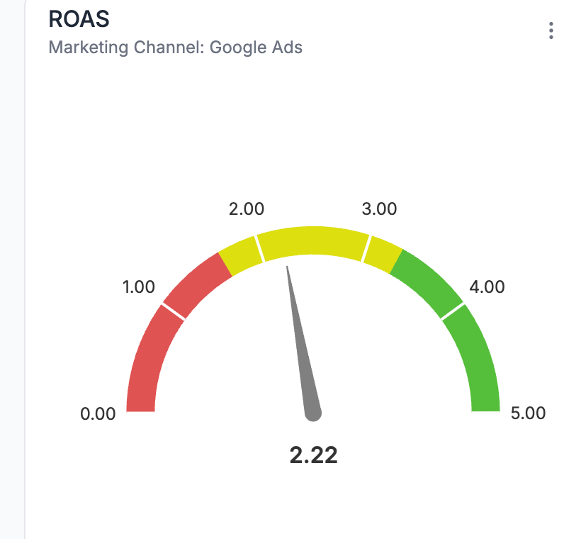
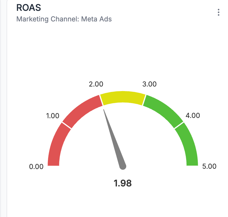
9. Gauge Widget
Progress indicator
The Gauge widget introduces a goal into the conversation. It shows progress toward a target, whether that’s revenue, orders, or another KPI. Instead of asking “How much did we do?” it answers “How close are we to where we want to be?”
10. Label Widget
Section heading
The Label widget doesn’t show data at all, and that’s exactly why it matters. Use labels to introduce sections like “Top-Level Performance,” “Channel Breakdown,” or “Product Insights.” Good reporting is as much about organization as it is about metrics.
11. Funnel Widget
Conversion Analysis
The Funnel widget is designed to illustrate how users progress from one step to the next and highlight drop-off points. Instead of looking at conversion rate as a single number, this widget breaks the journey into stages. For example, sessions → add to cart → order.
Use the Funnel widget when you want to diagnose conversion problems, evaluate landing pages, or understand how changes to site experience impact behavior.
Ready to Build Your Own Custom Reports?
Custom reports are designed to fit the way you think about your business, not the other way around. Choose the widgets that matter, arrange them into a clear story, and see performance without jumping between tools.
If you want to see how custom reports work in real time, book a demo with the ThoughtMetric team.
FAQs
Can I create multiple reports for different teams or use cases? Yes. Many teams create separate reports for leadership, marketing, product, or agencies, each focused on the metrics that matter to that audience.
Can widgets be rearranged or updated after a report is created? Yes. Widgets can be moved, resized, edited, or removed at any time as your reporting needs change.
Get full visibility into what drives your revenue.
You're spending on ads. We'll show you which ones matter.